
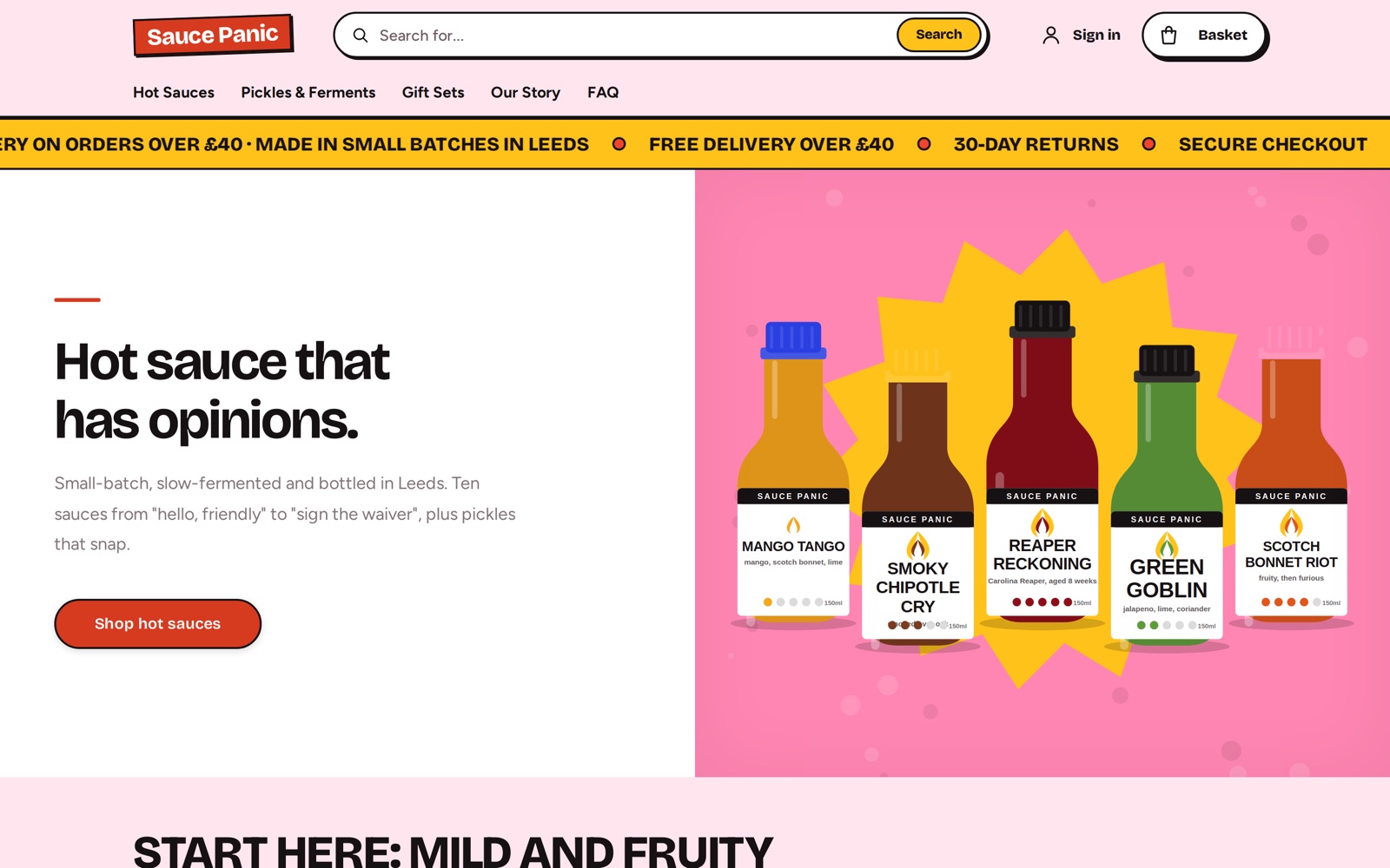
Six themes, each with a live demo
Every theme is built on the same platform, so features work the same whichever look you choose.
Nova
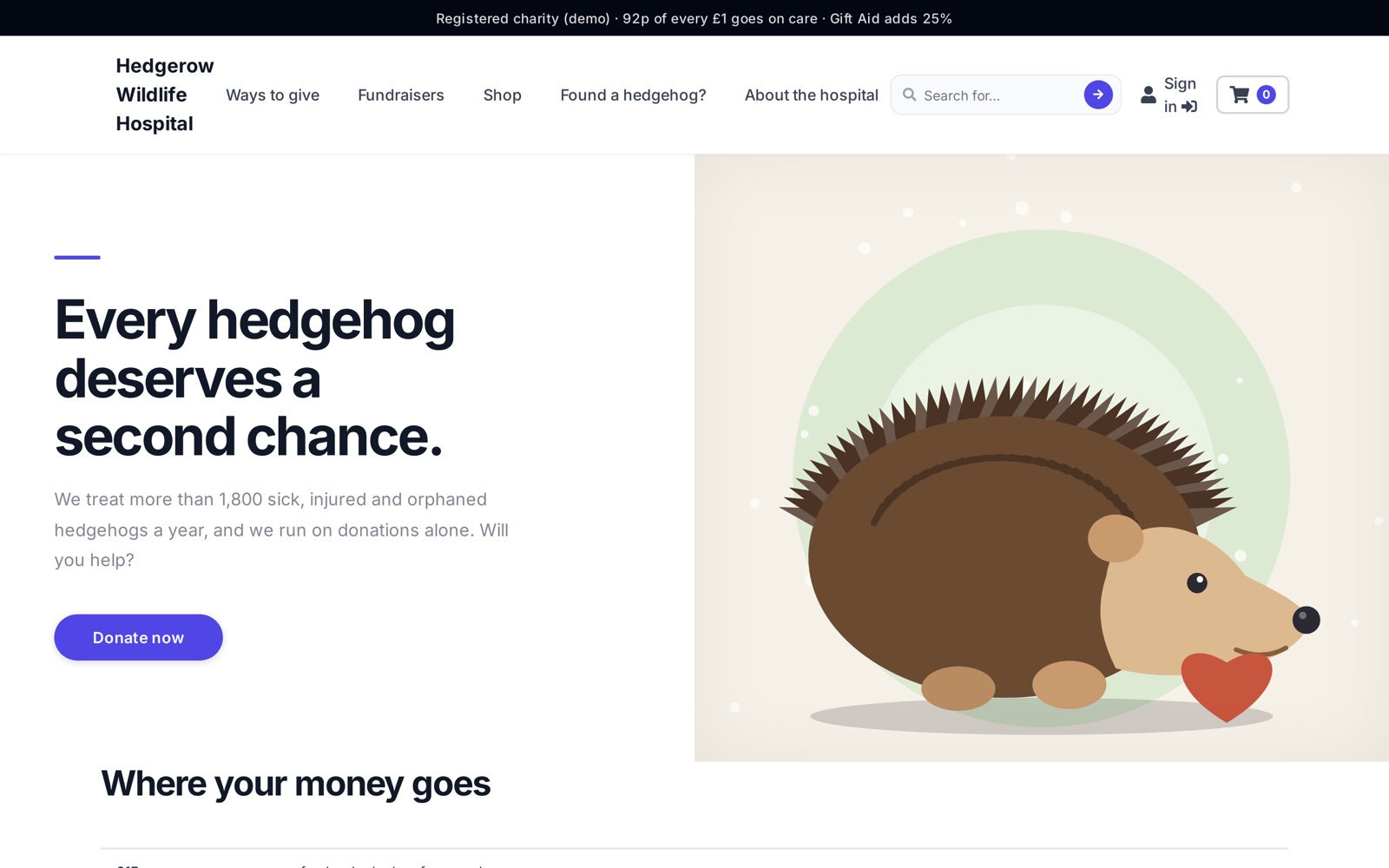
The platform default. Clean and fast with smooth page transitions. The safe starting point for most shops.
Brock
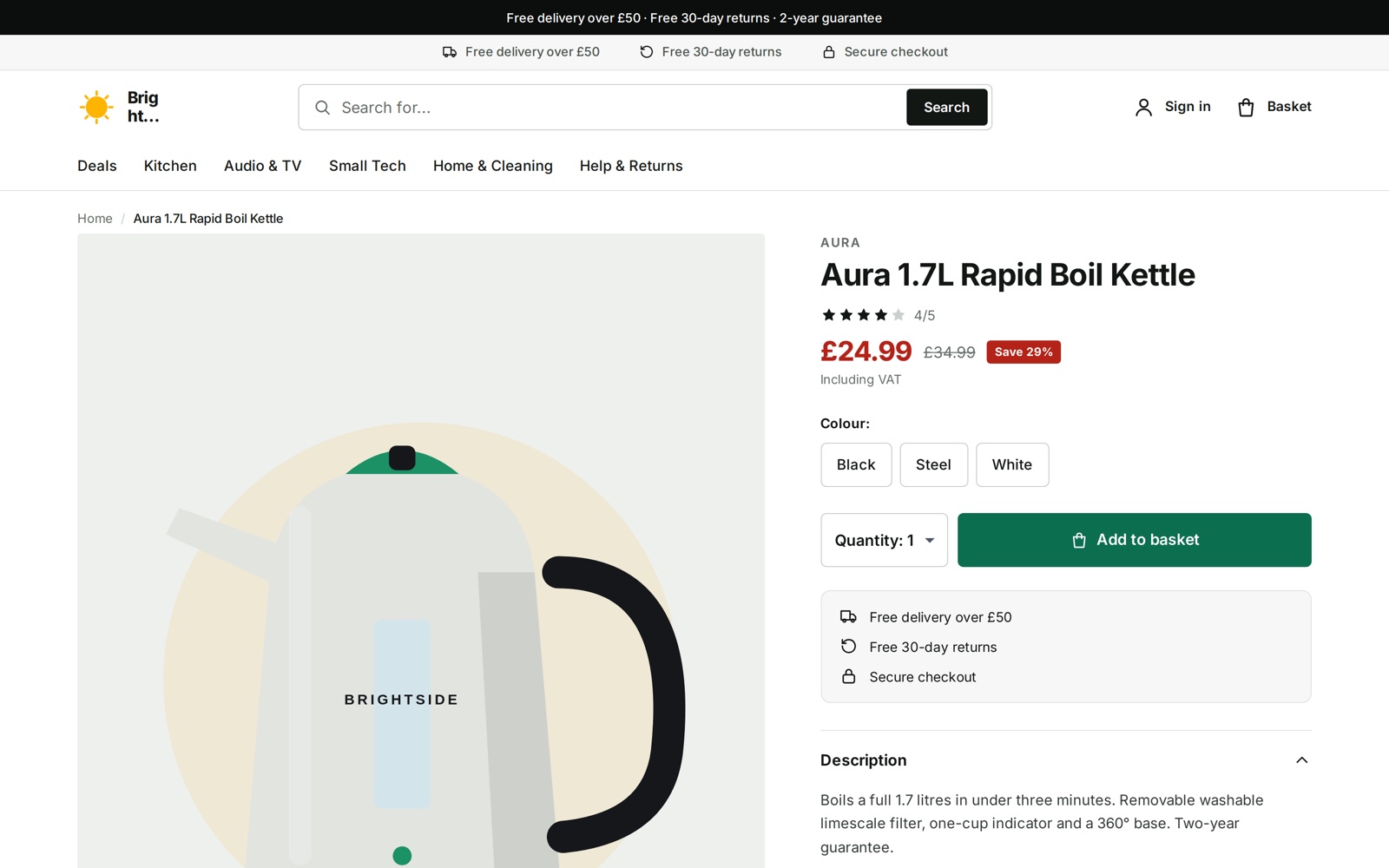
Conversion-focused: listings and product pages laid out to get from browsing to basket with the least friction. This site uses it.
Pop
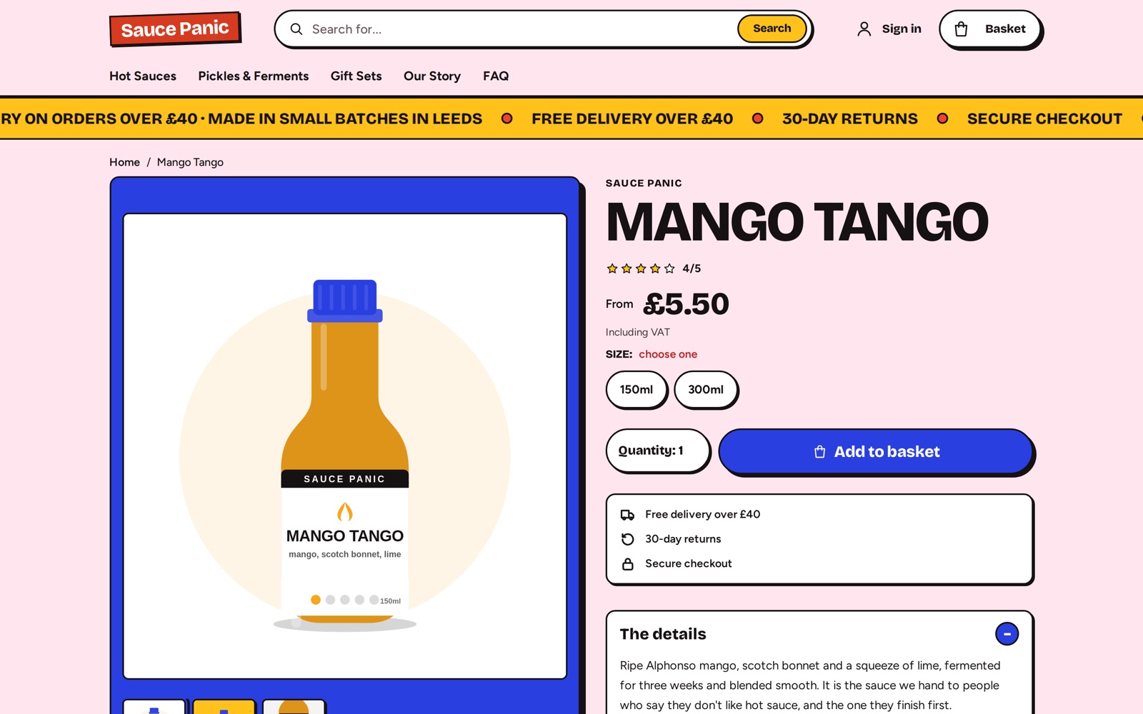
Loud and friendly: flat colour blocks, thick outlines and a colour for every product. For playful brands and gift shops.
Depot
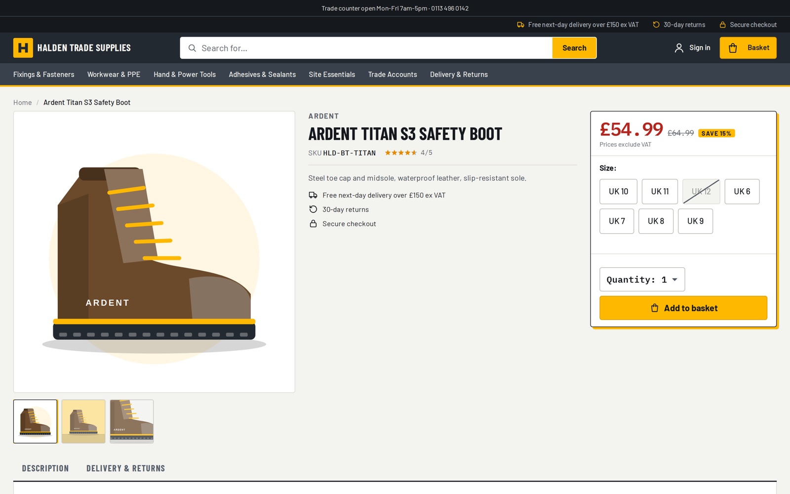
Dense and catalogue-first, with a persistent filter rail and quick-buy lists. For trade suppliers and anything sold by SKU.
Atelier
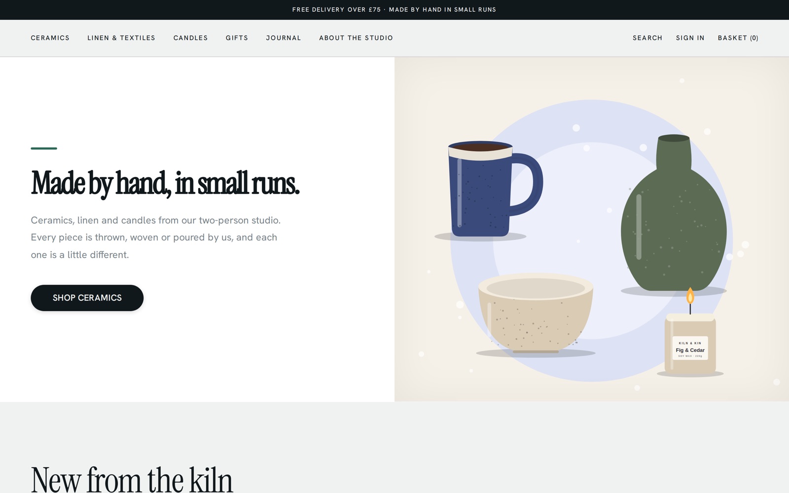
Editorial and image-first, with oversized serif names and an asymmetric grid. For design-led catalogues with strong photography.
Spec
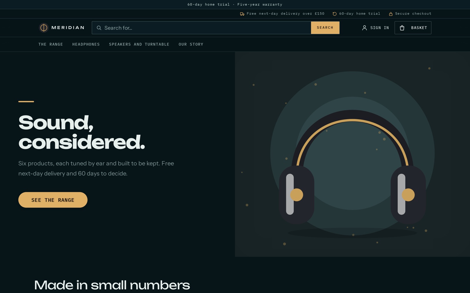
Dark and immersive, with the product as the hero and accents that follow the chosen colourway. For premium tech and audio.
Rebrand from one screen
The design brief holds your brand: voice, palette, fonts and shape. Change it and the whole shop restyles at once, including emails. AI assistants read the same brief before they write a word, so new pages match.
Brand palette, gradient and Google Fonts
Corner radius, shadow depth and product image shape
Custom CSS for the finishing touches
Honest badges: "Only 3 left" and "Sold out" appear only when they're true
Pages from blocks
Build any page from content blocks and place them in the slots each page has. No developer needed.
Heroes with five layouts and animated backgrounds
Flexible layouts with product grids bound to a collection
Animated explainer scenes
FAQs, email capture, featured and trending products
Video, maps, contact forms and social links
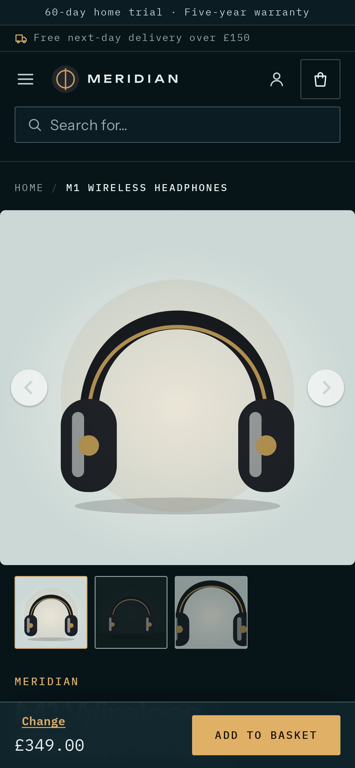
Built for phones first
Most shoppers arrive on a phone. Every theme is designed for small screens first: sticky buy bars, swipeable galleries, fast pages and smooth transitions between them.
Product images that glide from listing to product page
Variant choices kept in the URL, so links go to the right colour and size
Inline icons and lean pages for fast first loads
See it working, then decide
Try a demo shop, start a 14-day Lite trial, or talk to us about a larger project.